A community college teacher friend of mine put out a call for website makeovers his class could work on the next six weeks, and I volunteered mine. I had my first Webex call Tuesday and I’m excited to see what happens.
For my homework, I need to give them examples of websites that I like. I am partial to minimalist designs but I won’t rule out creative, eye-catching ones so long as the layout is organized. Bonus if they are multi-taskers like me.
Here’s my challenge. As I told the class, I mainly publish fiction. But I also write non-fiction for writers… take photos … and write memoir, eventually wanting to branch out into travel/cookbooks. (I am also a councilwoman, but I don’t want to emphasize that to avoid further clutter.)
The class asked, “What is the top message you want someone to get when they first get on your website?” Frankly, I had a hard time answering. I either have to celebrate my diverse offerings or rein in some. Ultimately I want a visitor to buy my books.
Here are my top minimalist picks, with an explanation of why I like them.
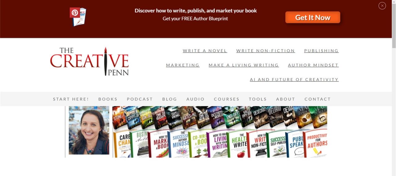
What I like: She does both fiction and non-fiction, as well as podcasts, so I made sure to check her site. For someone who offers a lot, she corrals her info pretty well. Fairly neutral for some of the non-fiction crowd. (I say some because I believe that most of my non-fiction audience are women writing fiction.)
What I don’t like: Layers upon layers of clickable information that lead to more layers. It is like a rabbit hole of information. I want mine more simple; it may entail having to really pick and choose what I’m actively offering. The text links on the top right would be nicer as buttons or actual tabs. She could probably do away with that landing page book cover photo and it wouldn’t hurt her message.
2. Ransom Riggs
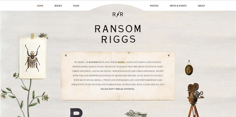
What I like: Playful, visual, eclectic. I am a sucker for everything vintage even though that is not my target demographic. Interesting even though the colors are subdued and monochromatic. He also does photography.
What I don’t like: The lovely pictures are a guesswork as to where they lead, but I suppose it adds to the charming discovery-style nature of the website. If I were on the prowl for specific info though, that would frustrate me as a visitor. P.S. The tabs on the top do correspond to the pictures.
3. Jody Hedlund
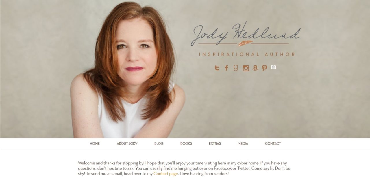
What I like: The simple visual uses her portrait, emphasizing her brand rather than any of her books. Because I am always putting out content (books in different series, fiction / non-fiction), this design means I don’t have to change my landing page content all the time. I like that her portrait details (her hair color) tie into her social media button colors.
What I don’t like: Bland color scheme.
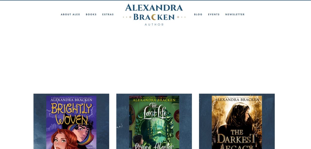
What I like: The masthead is clean and nicely done. That little moon motif is lovely. Her books are front and center.
What I don’t like: The books are way down the landing page, wasting space.
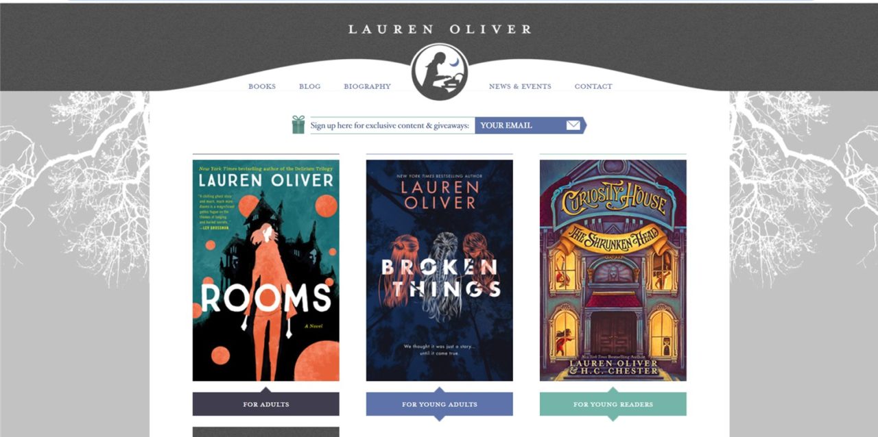
What I like: The strong header with the solid dark gray block. Leads the eye down to the tabs. She writes in different genres, which is delineated in the row of book covers. The branch silhouette frames in white and gray are cool.
What I don’t like: Not so much what I don’t like, but my books should have a cohesive design and feel for this website design to work.
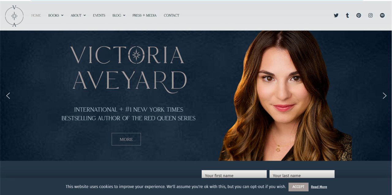
What I like: Strong visual image. Evergreen design, regardless of what sorts of books I produce later. Clean and minimalist, even though the color palette (navy blue) is dark. The option of the slider showing a page for some featured books is nice. This will take some investment of time on my part, but some book sliders could be doable for me.
What I didn’t like: Nothing really.
7. Jake Knapp
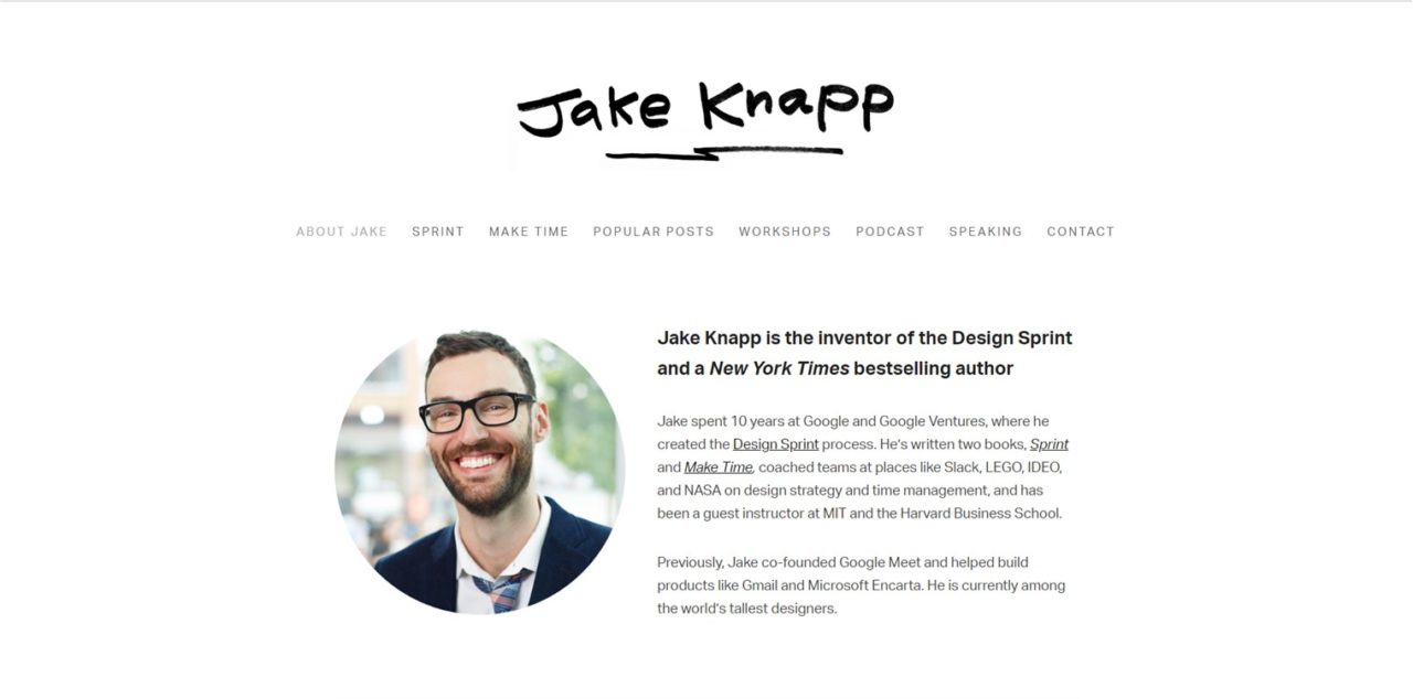
What I like: Couldn’t be more minimalist if I tried. Focus is on Jake and not on his books.
What I don’t like: Almost too minimalist. So much stark white.
In a nutshell, I confirmed that I enjoy the minimalist vibe, gravitating toward mostly lighter colors. I like portraits that make the author look approachable and credible.
I prefer sites that don’t scroll through a lot of information from the landing page. It’s like dating–if I like the first impression, I can take the time to click through and get to know the person. But until then, too much information is overwhelming.
This is not an exhaustive minimalist-author-website list by any means, but I hope they give you some ideas. What do you think? Pop any others you know of in the comments.
I write books. Visit my Amazon author page.
 Follow
A good summation of what makes an appealing webpage. The minimalist look is popular and I am partial to it, too. I am in the process of updating my own webpage, and you have giving me some food for thought. Especially the question at the beginning you pose of knowing what you want your website to say.
Great! Glad it’s helpful to you too. Good luck with the website update.